Children of Conflict
Brand Identity: International ConferenceBackground: ‘Children of Conflict’ was an innovative conference bringing together global best practice and world experts to tackle the growing crisis in youth education and unemployment, particularly in societies emerging from conflict. The aim was to make a positive, practical and measurable impact on resolving the NEET crisis (young people not in education, employment or training), through early intervention with young children. The conference had a strong international focus, drawing on delegates from Gaza, Israel, Japan, Africa and the USA.

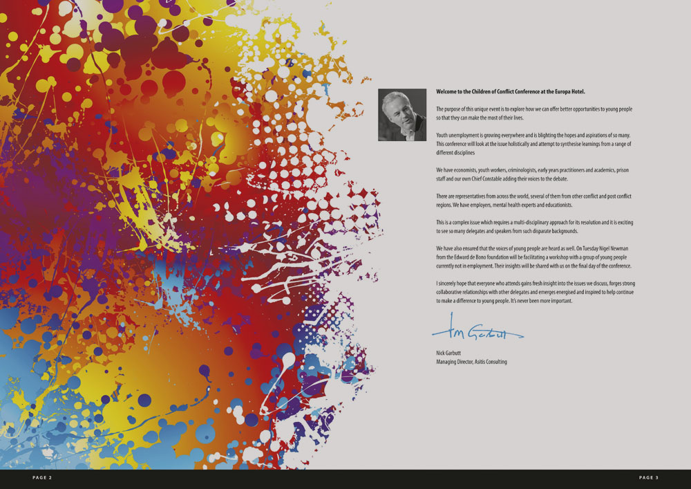
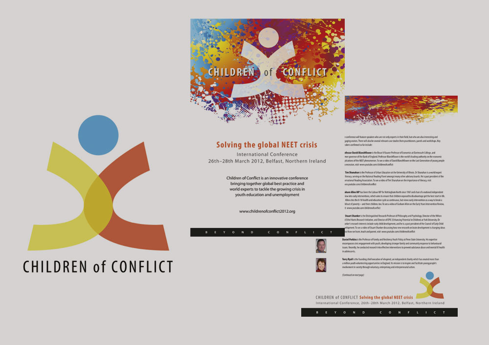
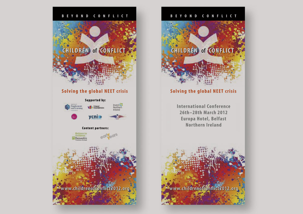
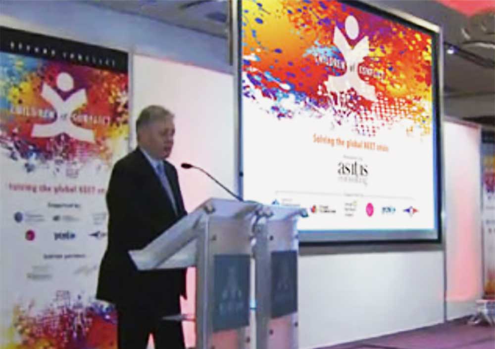
Our solution: The two ‘C’s in the conference title create a logo that is a visual representation of two sides coming together: merging, discussing, solving. The top circle completes the main symbolic reference to a child reaching out. A background of lively, colourful brush strokes was introduced to provide impact for use as a backdrop to the main stage and marketing material.


