Jcomms
Brand Identity: Comms/PRBackground: JPR is the longest established Public Relations company in Northern Ireland and has a solid reputation for providing professional public relations, event management and media relations to a high profile list of clients. As well as providing these services, JPR was evolving rapidly, with an increasingly strong focus on the provision of digital and content services. In order to reflect this strategic shift in the services offered, JPR decided to change it’s company name to Jcomms.
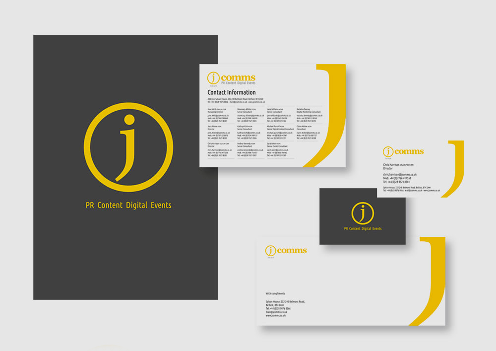
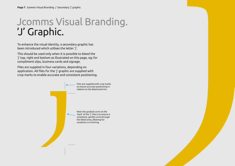
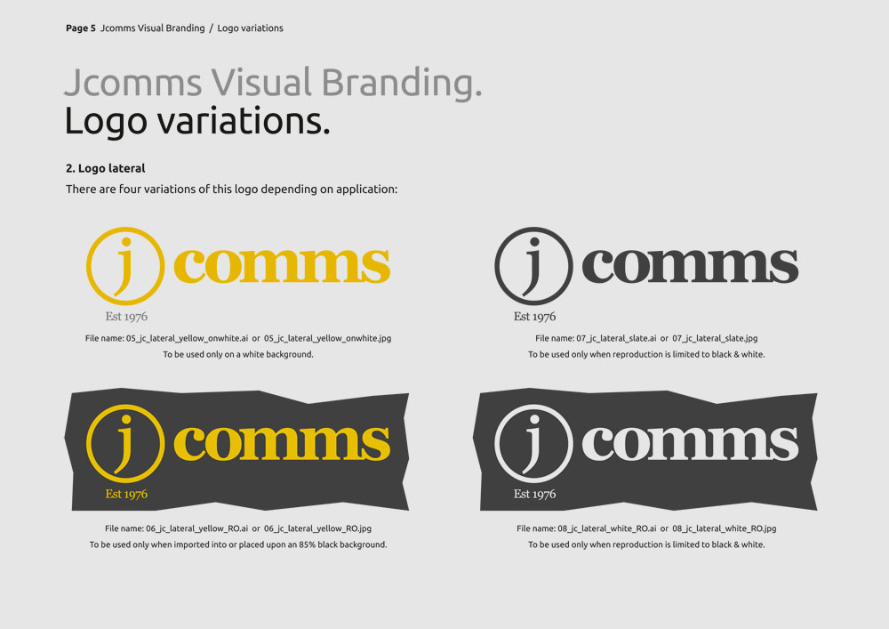
Our solution: We wanted to visually reflect this change of focus to show a forward moving, reliable, established and professional organisation. Our typographic solution features a simple yet prominent ‘j’ (customised from the typeface Trajan), within a circle. The tightly letterspaced lower case ‘comms’ forms a solid base for the logo, with old style non-aligning figs for the year established. The letter ‘j’ has also been introduced as a secondary graphic, to enhance and add impact to the identity throughout implementation.

