Jonathan Keys Opticians
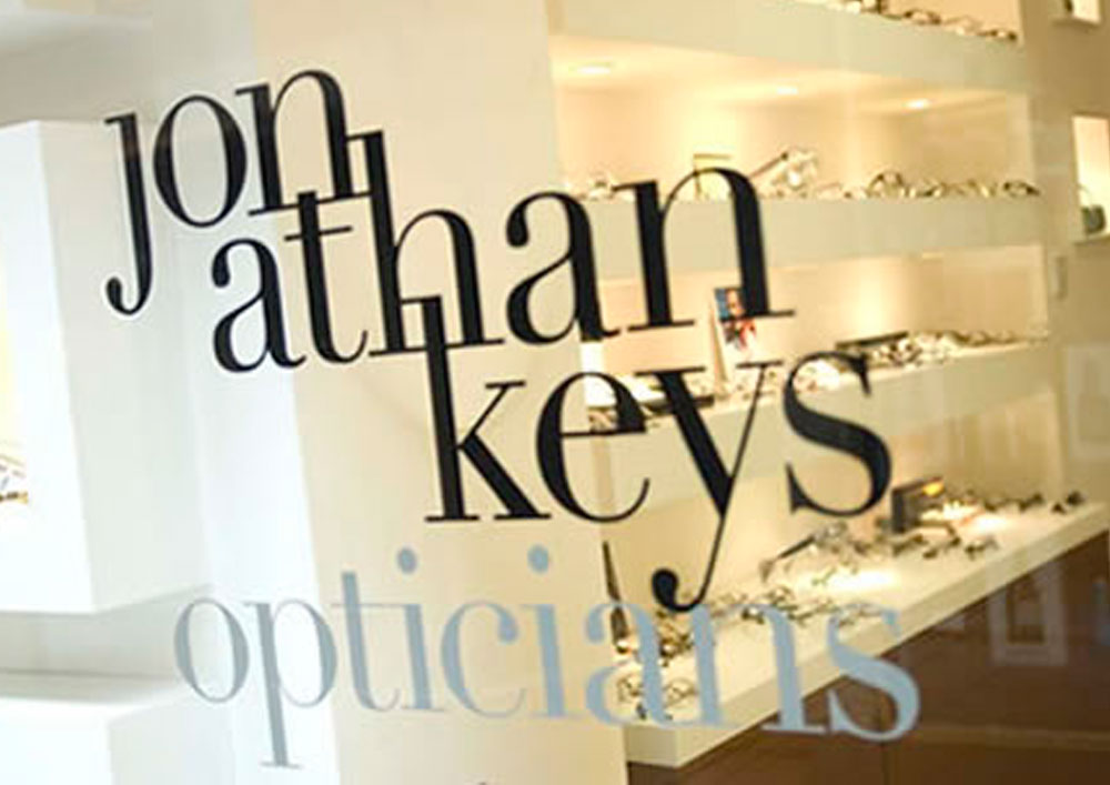
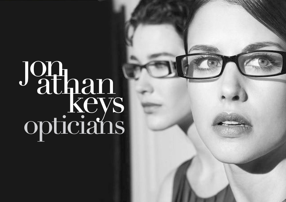
Brand Identity: RetailBackground: This independent, upmarket opticians, situated in Belfast’s fashionable Queen’s Arcade, required an identity that reflected its stylish and individual products and personal service.
Our solution: A personal and exclusive tone is communicated in our distinctive logotype design. Utilising the classic Firmin Didot typeface (named after its French designer) in black and grey, we massaged, cut and designed individual letters and ligatures, styling a chic, bespoke brand.


