Old Street Publishing
Brand Identity: Book PublishingBackground: With emerging authors over a wide range of subject areas, this young publishing company needed a fresh, memorable colophon which would have visual impact, not just on the spine of a book, but throughout a range of online and printed promotional material.
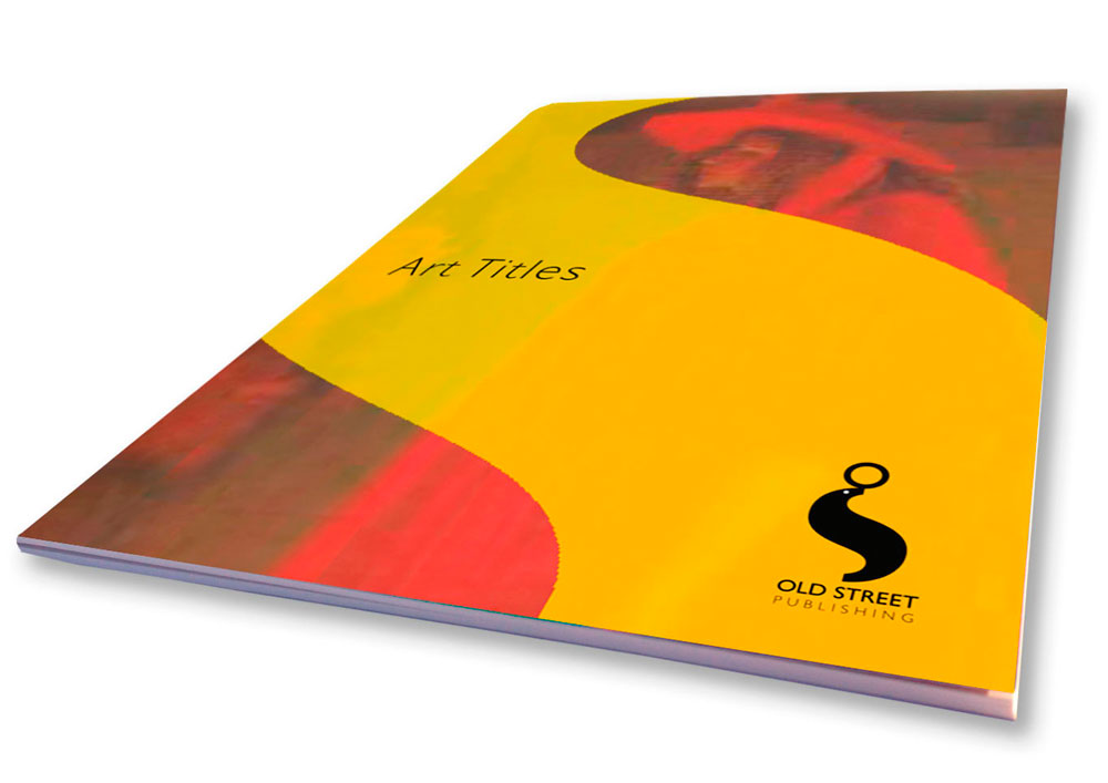
Our Solution: The ‘O’ and the ‘S’ from the company name are designed to form a sea-lion and ball logo, resulting in a witty, strong and likeable colophon. As well as playing a key role in identifying Old Street as a dynamic, emerging publishing house, the logo is utilised as a graphic device across a range of marketing material, including catalogues, brochures and advertising. The distinctive curve of the ‘S’ moulds a secondary device which visually unifies a diverse range of photographic and illustrative imagery.


