Quercus Books
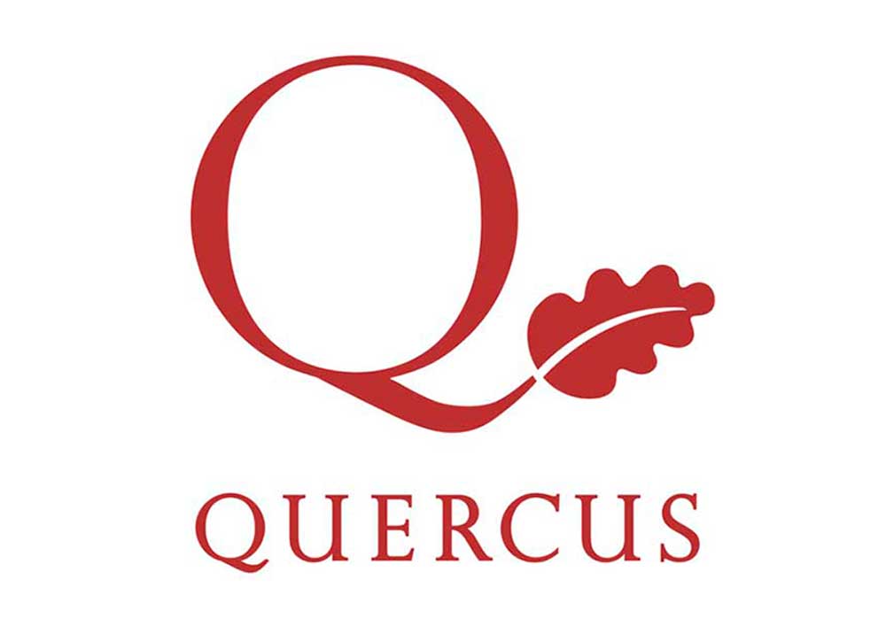
Brand Identity: PublishingBackground: Having designed several books for Quercus we couldn’t help noticing that their logo, in our opinion, wasn’t flourishing in a way that it could. So, whilst we were presenting some of our book designs, we put forward this logo proposal to Quercus.
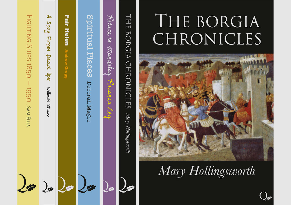
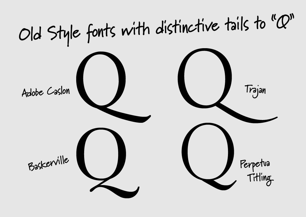
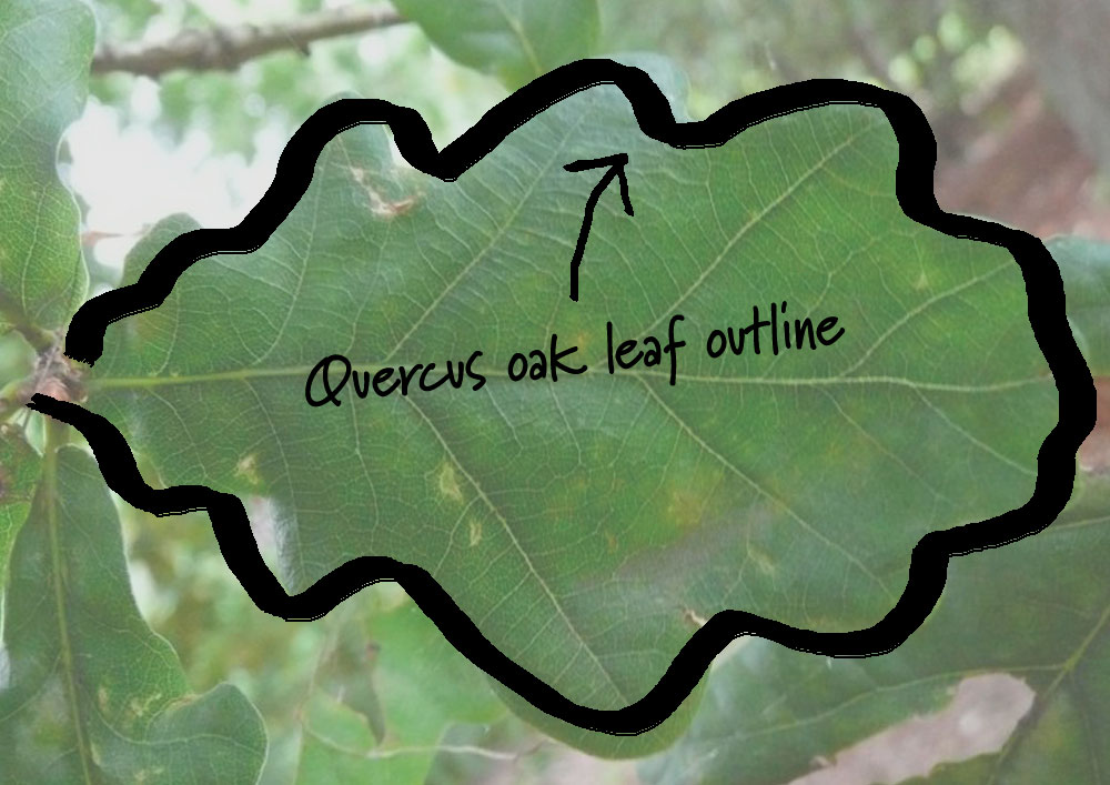
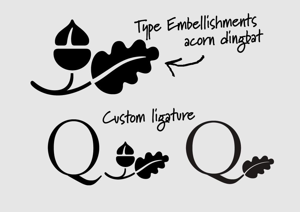
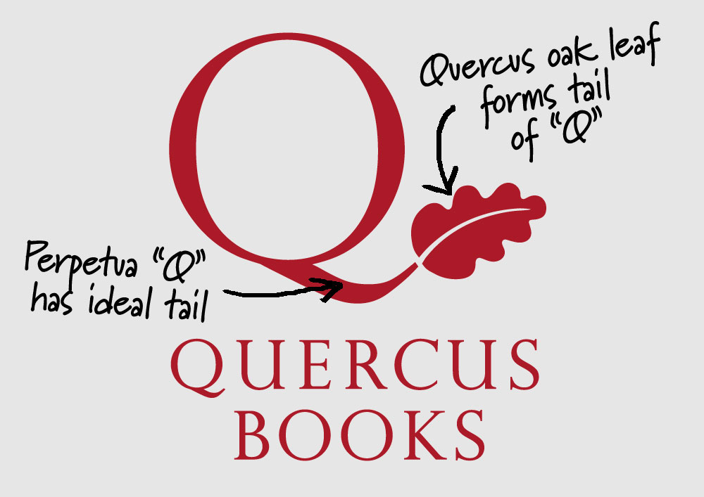
Our solution: A beautiful ‘Q’ with a tail to be proud of. We experimented with several different classic typefaces and how a quercus oak leaf could flow effortlessly as the tail of the ‘Q’. Importantly, we considered this as a distinctive brand when displayed on the spine of a book (prime real estate for a book publisher), by wrapping the ‘leaf’ half of the logo onto the spine.

