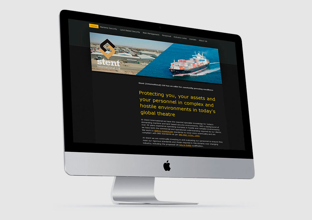
Stent International
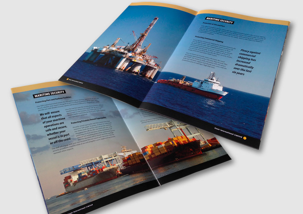
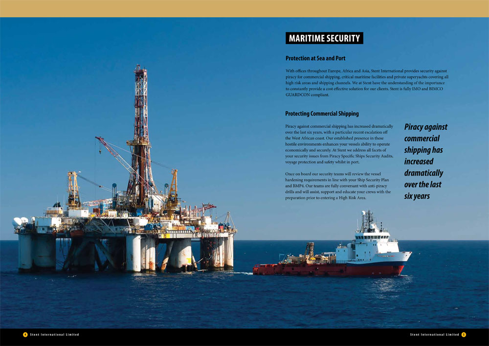
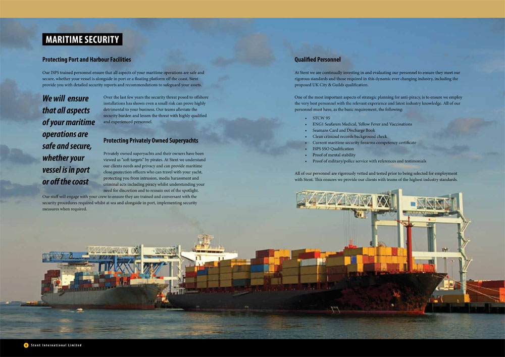
Brand Identity: SecurityBackground: Stent International provides specialist security in some of the world’s most hostile environments, including piracy, critical maritime facilities and high profile land-based situations. Trusted by Governments and private enterprises alike and with offices throughout Europe, Africa and Asia, Stent International required a branding programme that reflected a strong, cutting-edge, international security company.

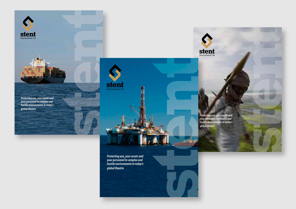
Our solution: The two major environments of land and sea are symbolically represented as the top and bottom halves that create the enclosed, angular ‘S’ logo, emulating protection and strength. The black and gold colour scheme reinforces stability and security, with the typography (based on Rockwell Bold) being specially modified to create a safe, solid and strong identity.

